About this project
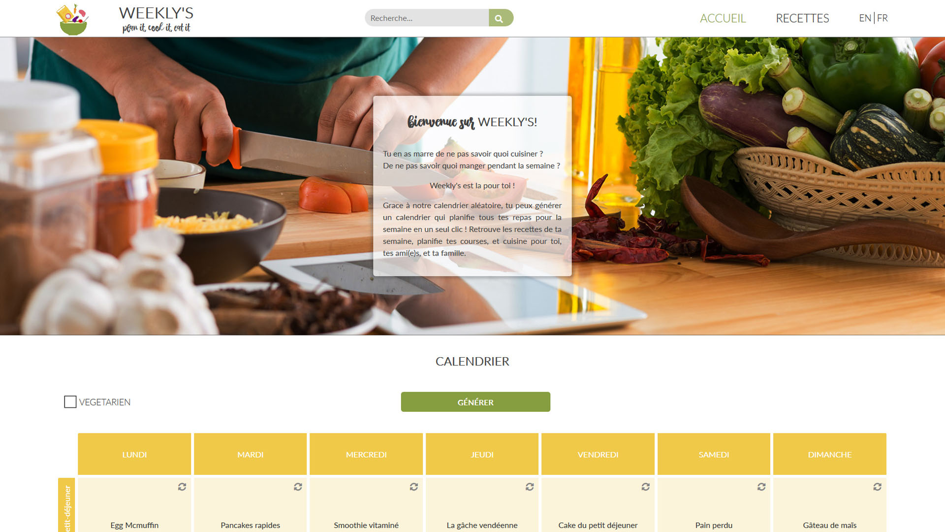
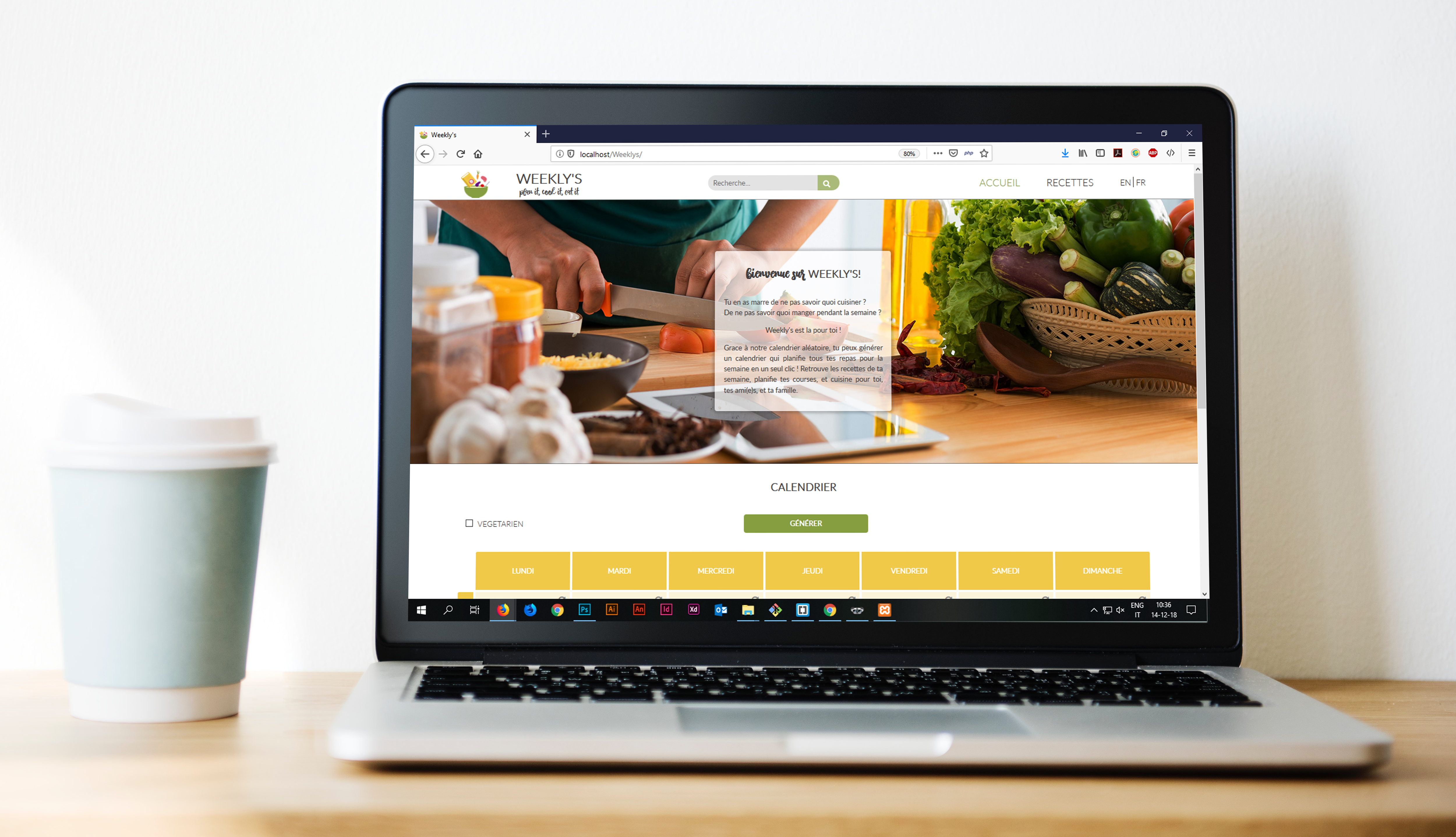
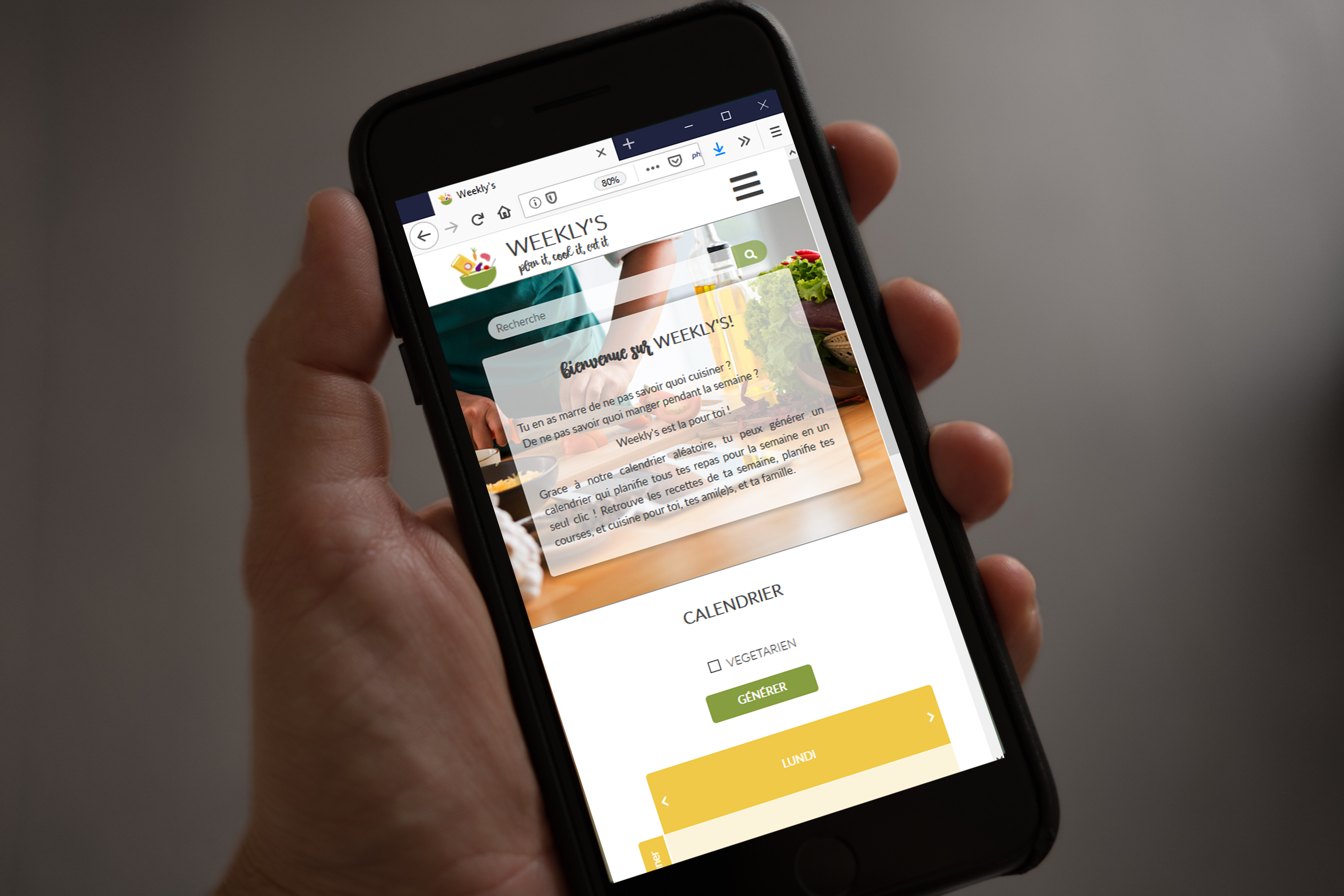
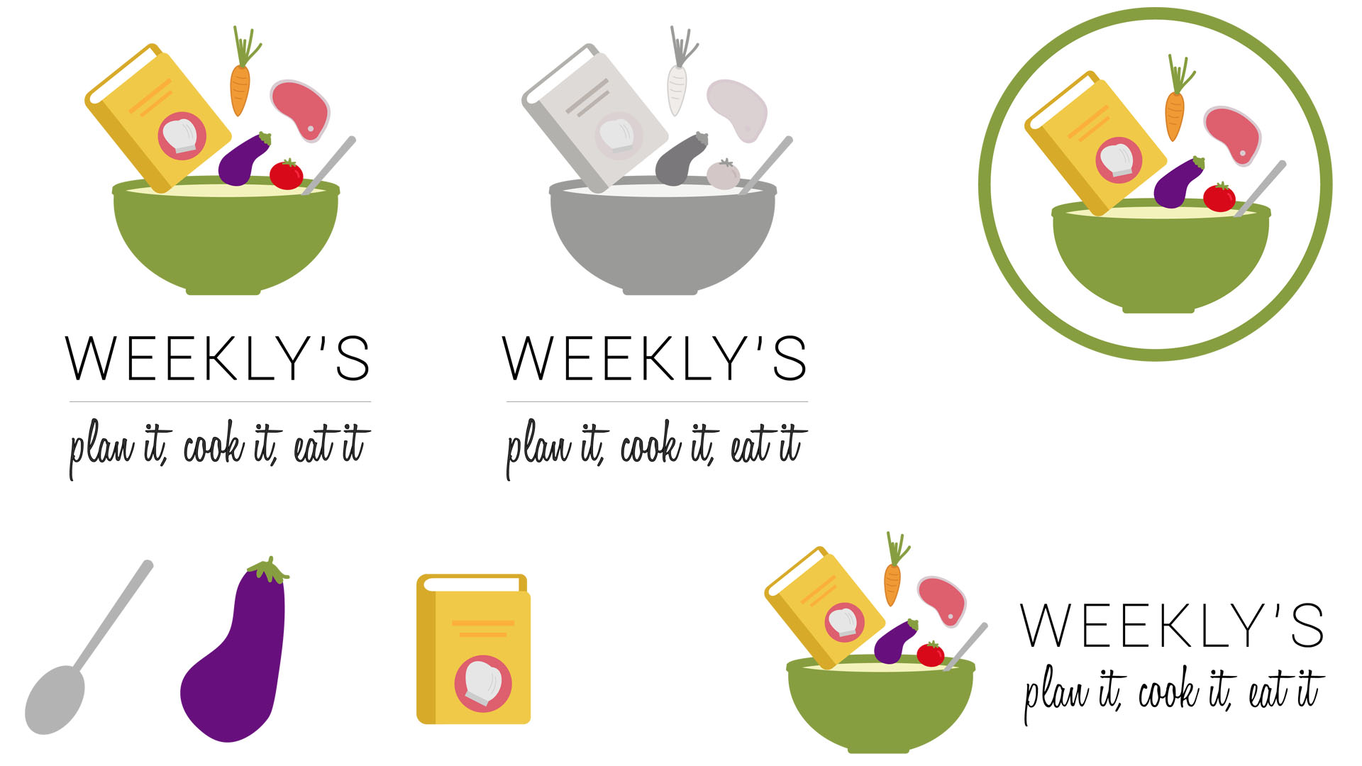
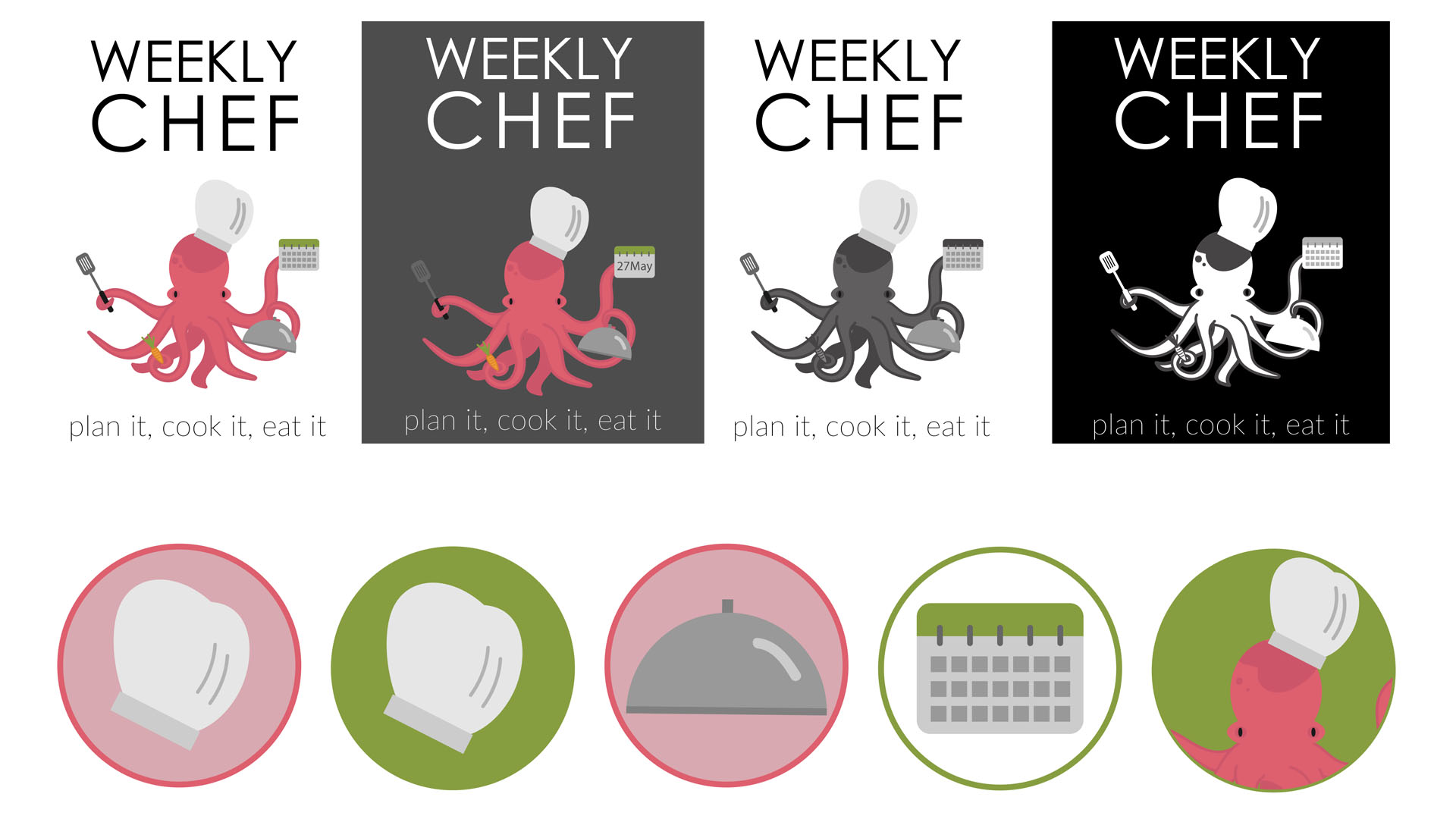
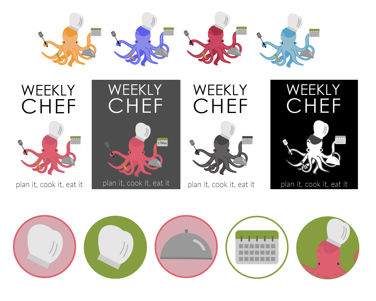
This is a logo and name proposal that I created for the brand of a recipe website built for a school project. The website's main feature is a calendar generator that prepares a weekly meal plan for the user. The name "Weekly Chef" is meant to highlight that feature, and suggest to users that they, too, can cook like a chef for a week with the help of our website. The tagline "plan it, cook it, eat it" serves as a quick explainer for what the website does. The chosen fonts were Century Gothic and Lato Thin.
The Octopus in the logo takes on the role of the chef. Having eight arms to juggle all the tasks needed while cooking is an advantage, of course - but with the help of our website, our users will manage just as well. The calendar that he's holding, of course, leads back to the themes of planning and preparedness. The coral, green and orange are colours from the website palette that I integrated into this logo. I also prepared differently coloured alternatives to the Octopus, as well as black and white alternatives.
The octopus could be used as a mascot as well, to appear in promotional videos, tutorials, and chats. I also prepared a set of icons to go along with the octopus and that could be used throughout the website, creating a cohesive overall brand and image.
